April 3, 2025 Written by Gotzha
Product Page vs Blank Page in CC Submit
Breaking down differences, funnels, and strategies — clearly and objectively
When working with CC Submit offers, affiliates often face a choice: whether to use a product page or a blank page as the final payment page. Both options are valid and effective — if you understand how to work with them. Below is a clear comparison between each (or them), the structure of their funnels, and the pros and cons of each approach.
General Funnel Structure
Regardless of the landing page type, all CC Submit flows include a presell page. This is the entry point of the offer where you:
- explain the “promo” or the hook;
- warm up the user (via quizzes, advertorials, reviews);
- lead them to action (click, redirect).
The basic structure looks like this:
→ Ad Creative
→ Presell Page (made by the affiliate)
→ Product Page or Blank Page (checkout hosted by the advertiser)
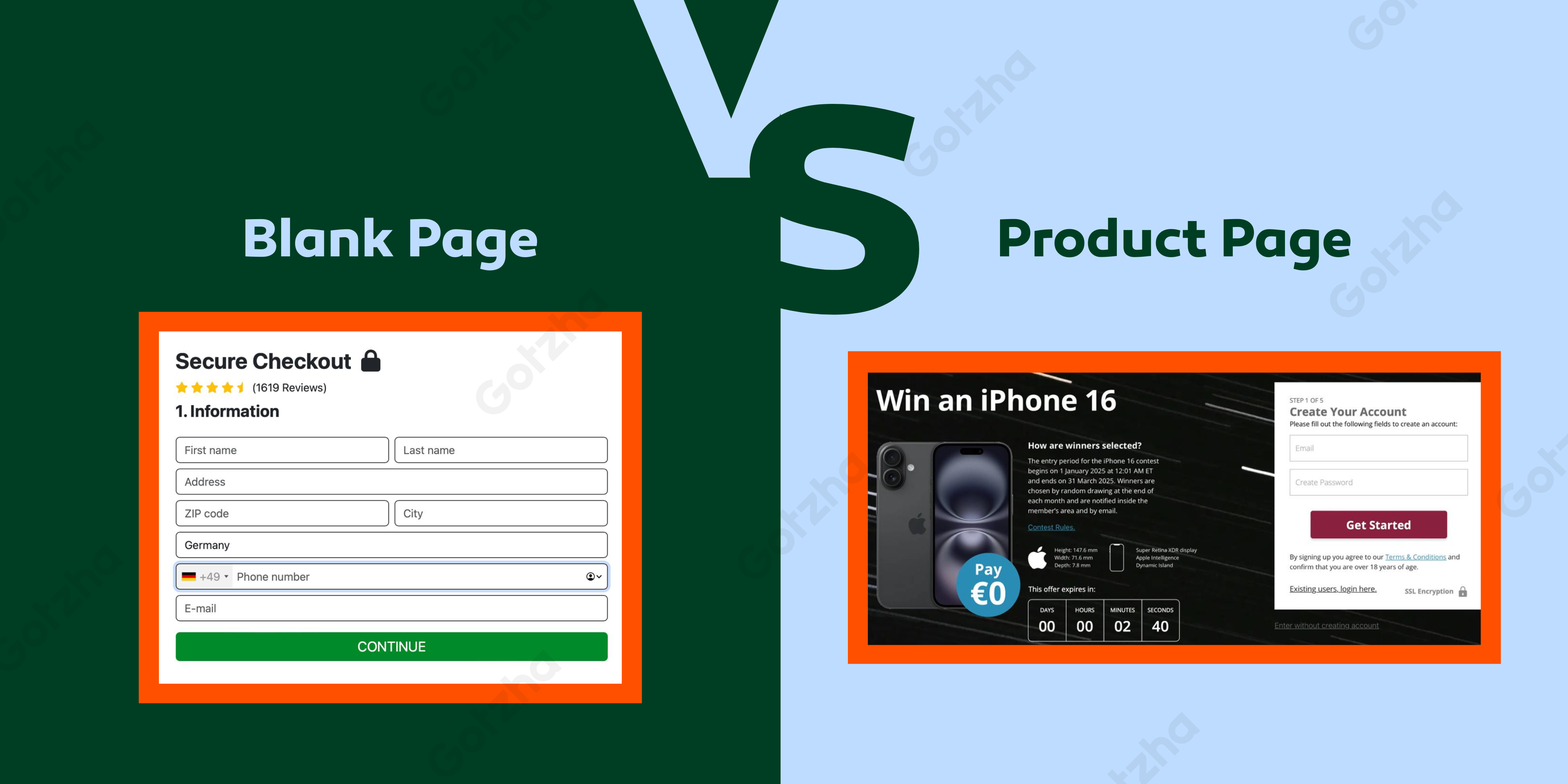
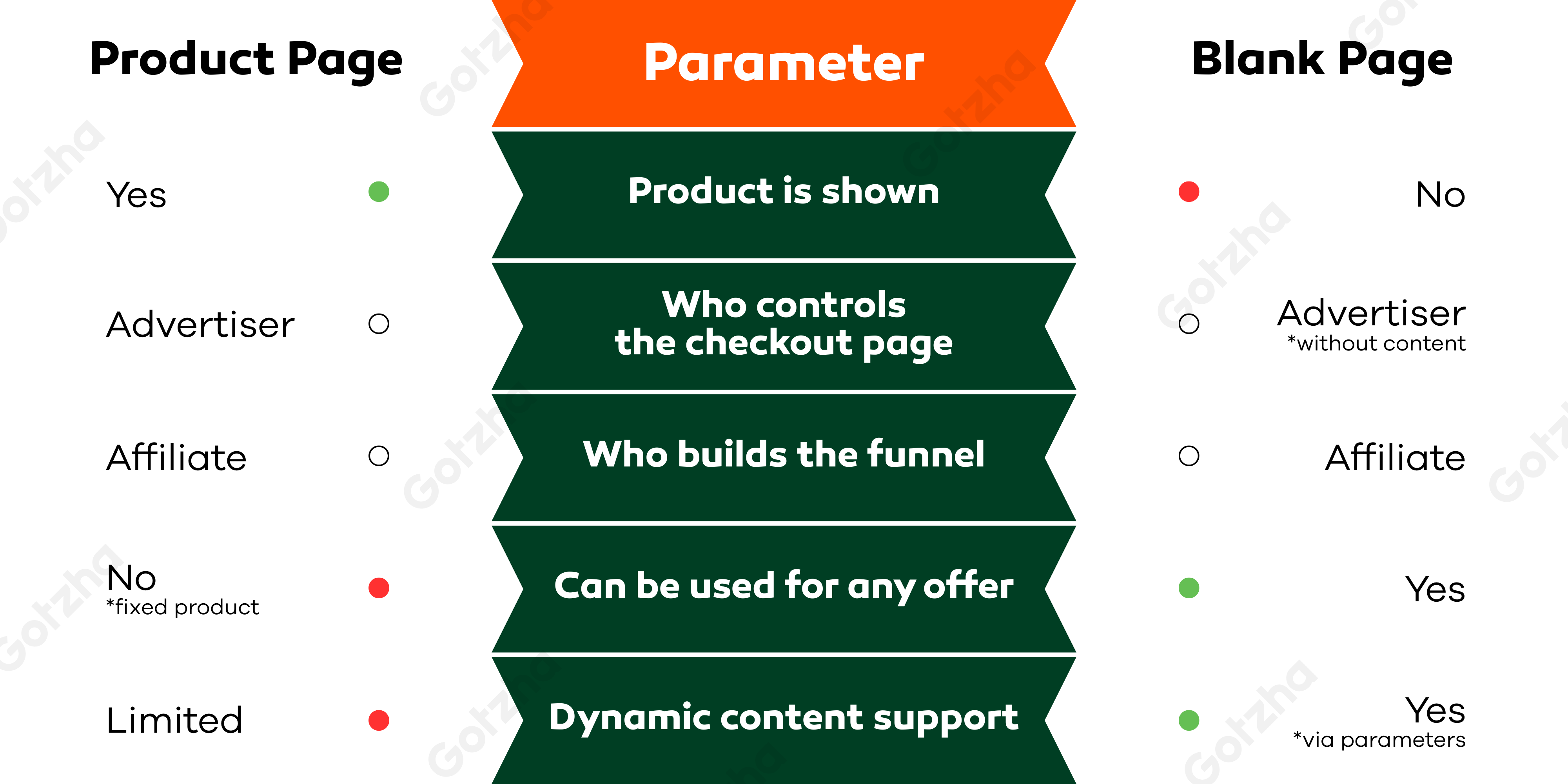
What is a Product Page
A Product Page is a final payment page that advertises a specific product. The user has a clear understanding of what they’re paying for — product name, image, short description, price, and branding.
Key features:
- Content (product, layout) is defined by the advertiser;
- Payment form is either embedded or appears after after filling the registration form;
- Suitable for stable funnels;
- Easy to start with — no need to build your own product funnel.
What is a Blank Page
A Blank Page is a final checkout page without specification of a product. It only contains the credit card form — no product name, logo, description, or branding. This type of page can be used for any product since it’s not tied to a specific offer.
Advantages:
- Versatility — you can test different concepts using the same checkout;
- Flexibility — full control over the entire funnel.
- Faster launch — no need to wait for a custom page from the advertiser.
Dynamic Blank Pages
Modern blank checkout links increasingly support dynamic parameters, allowing you to:
- inject product images into the final page;
- add headlines or descriptions (e.g., via UTM tags or URL parameters);
- customize the checkout appearance depending on the offer.
This makes blank pages more customisable and easier to scale.
➕ Pros of Each Approach
Product Page:
- Higher user trust (product is shown before payment);
- Better suited for “clean” traffic sources;
- Lower risk of chargebacks and cancellations;
- Easier to validate quality in the eyes of the advertiser.
Blank Page:
- Maximum freedom in funnel design;
- Allows testing of raw or early-stage concepts;
- Works well with ecom-style flows involving multiple products;
- Suitable for aggressive advertising (push/pop/in-page).
When to Choose Each Option
Use a Product Page if:
- You're working with clean traffic sources (Facebook, TikTok, native);
- Approval rate and stable CR are key priorities;
- You’re testing an offer that already has trust and branding.
Use a Blank Page if:
- You’re building the entire funnel yourself;
- You’re using aggressive or native traffic (push/pop/in-page);
- You work with multiple products and need flexibility.
Conclusion
Both approaches are valid. The key is understanding which part of the funnel you control, what risks you’re taking, and what benefits you’re unlocking.